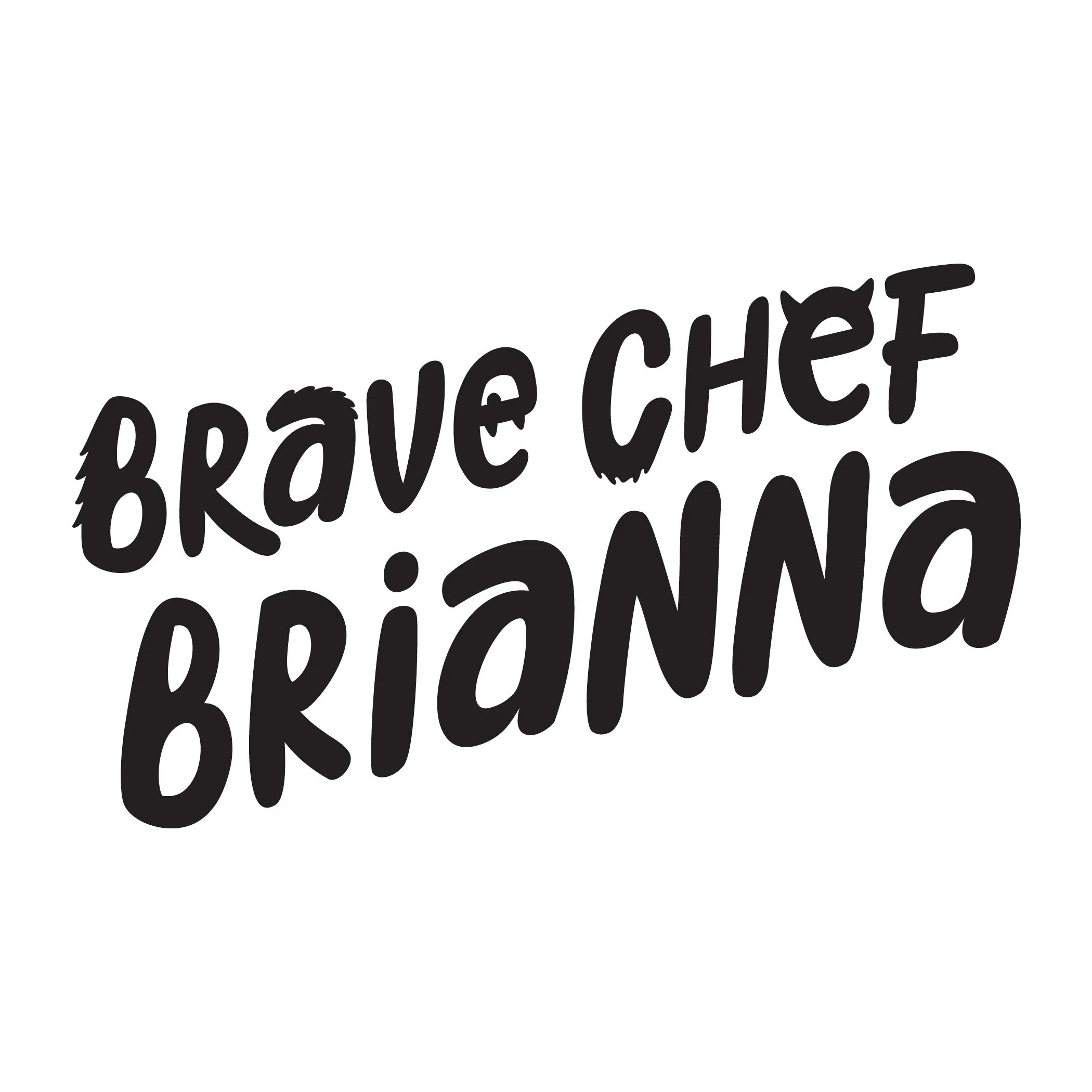
The mixed case and bubbly letters used in the Brave Chef Brianna logo skew toward a younger audience, while the addition of “monster” features hint at deeper themes within the series.
Client: BOOM! Studios / KaBOOM!
Target Demographic: Young Readers / Middle School
Designed with: Illustrator
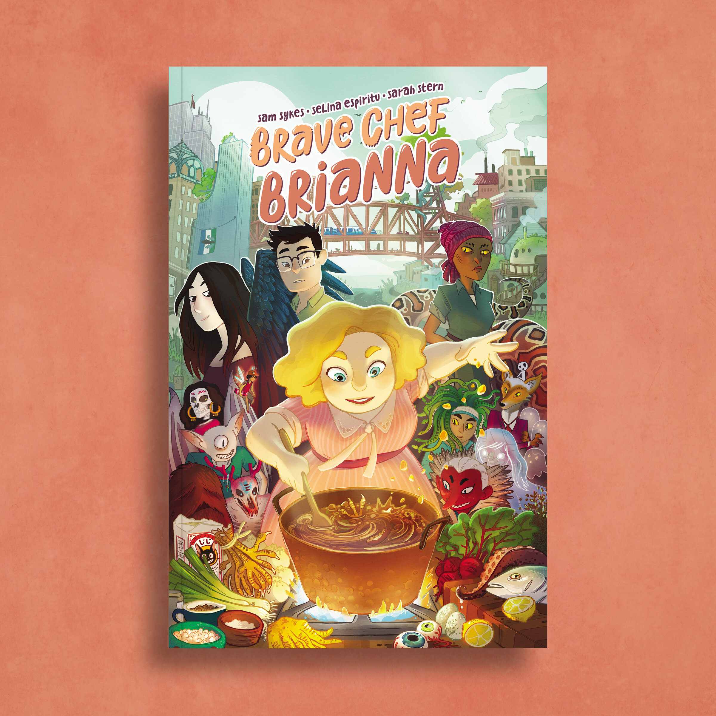
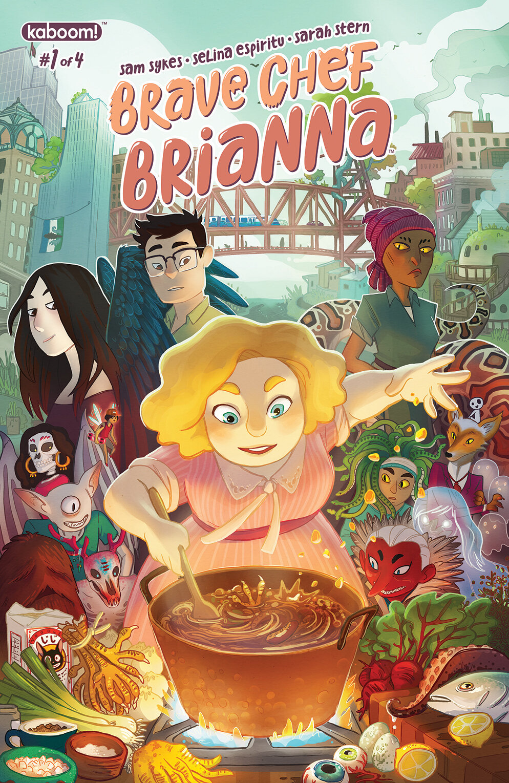
Welcome to Monster City!
When Brianna opens a new restaurant where the main clientele are monsters, she must conquer both her inner and outer fears to find success.
Single Issue Cover Dress